Reading time 6 mins + 14 min video
This feature is available with the Custom Analytics Builder Licence.
Introduction
Analytical dashboards are built on the dedicated website and sent to you with your account details. The folder structure replicates within your live Radar Healthcare system to allow your users to navigate to the dashboards they have permission to view. Using the datasets provided (either the standard Radar Healthcare datasets or your personalised custom ones) you can build your dashboards to display the key information required.
Logging in and Getting Started
- When your account is ready you will be sent details of your dedicated Analytics website and your associated login details.
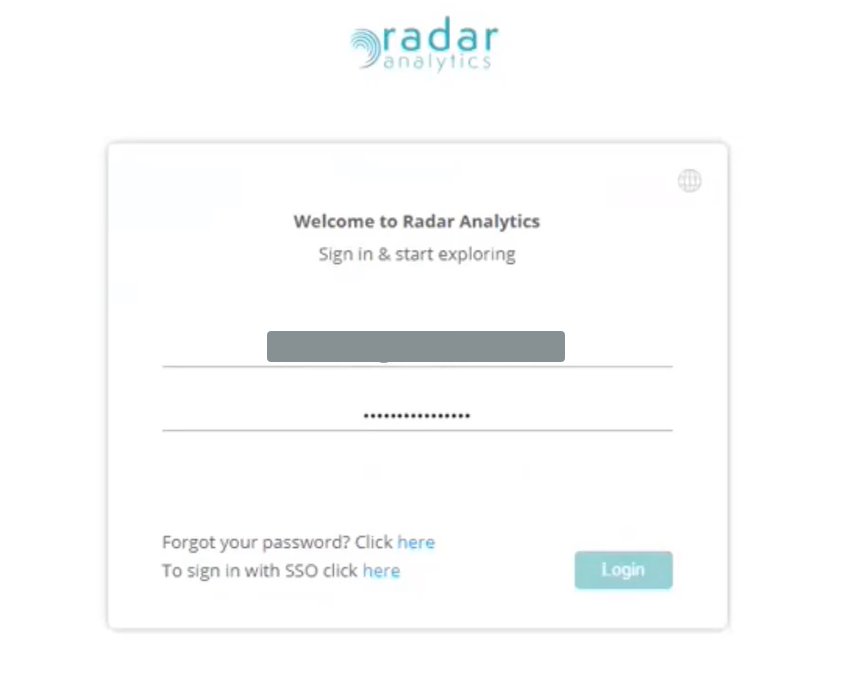
- All dashboards are built on your dedicated analytics website. They will only be visible once you choose to share them in your live Radar Healthcare system.
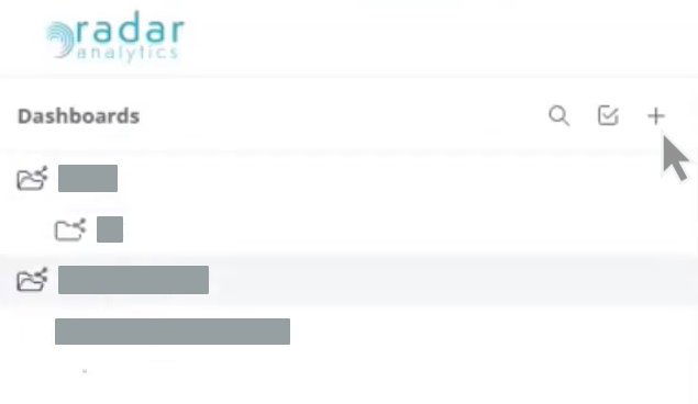
- Using the plus icon, you can create new folders, sub-folders, and dedicated dashboards.
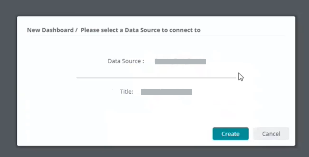
- When creating a new dashboard, you will be asked to choose your Data Source. This will consist of a series of data sets (sometimes referred to as 'cubes'). There will be a range of standard datasets from Radar Healthcare used to build our out-of-the-box dashboards, and there may be customised datasets designed by your organisation to include data specific to yourselves. Select the drop-down option of which Data Source you wish to use for your dashboard.
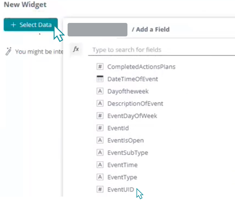
- You will be presented with a blank dashboard. A dashboard will be made up of a number of different visualisations. Choose Select Data and select which of your data fields you wish to use as the basis of your first visualisation. For example, if you wish to produce a number displaying the volume of Events which has occurred select EventUID - this field identifies each Events unique ID.
- With the data field selected explore the options to ensure it displays as you require. We recommend the Advance Configuration option to explore all the different options available.
- On the right-hand side of the screen, you can choose the different graphical display options, choose where the data should be displayed on your visualisation and include additional data for trending, comparisons, and exploration. The default display visualisation is the Pivot.
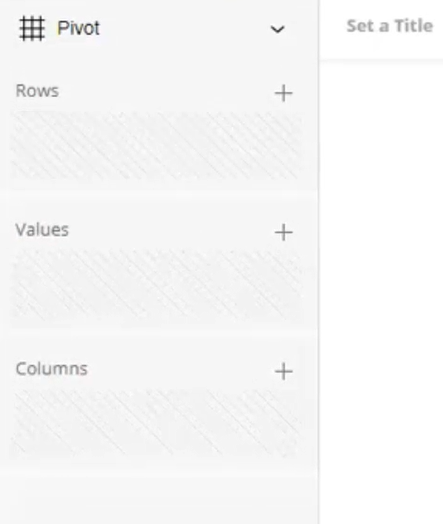
- On the left-hand side of the screen are your options to add filters to your visualisation and amend the way it is displayed with the design options.
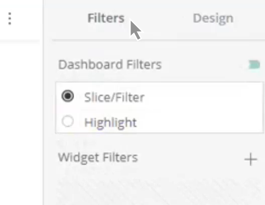
- Once saved you will be brought to your dashboard. Drag and drop the visualisation in place and use the options to increase or decrease the size accordingly.
- The video below explores this in more detail.
- Deep dive into Dashboard building on the dedicated Sisense knowledgebase. There is a wealth of materials available. We recommend:
Example 1: A League Table / Bar Chart
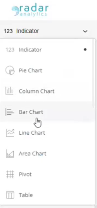
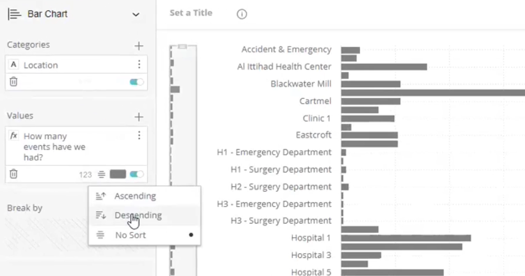
- Having started your visualisation on your chosen dataset we recommend a Bar Chart to display comparison data, such as a League Table. Use the options on the right-hand side of the dashboard to select the visualisation you wish to implement.
- Using the additional options on the right-hand side of the dashboard select the additional data you wish to use as a comparison. In this example, we're looking at the number of unique events reported and wish to add the category of Location as our comparison.
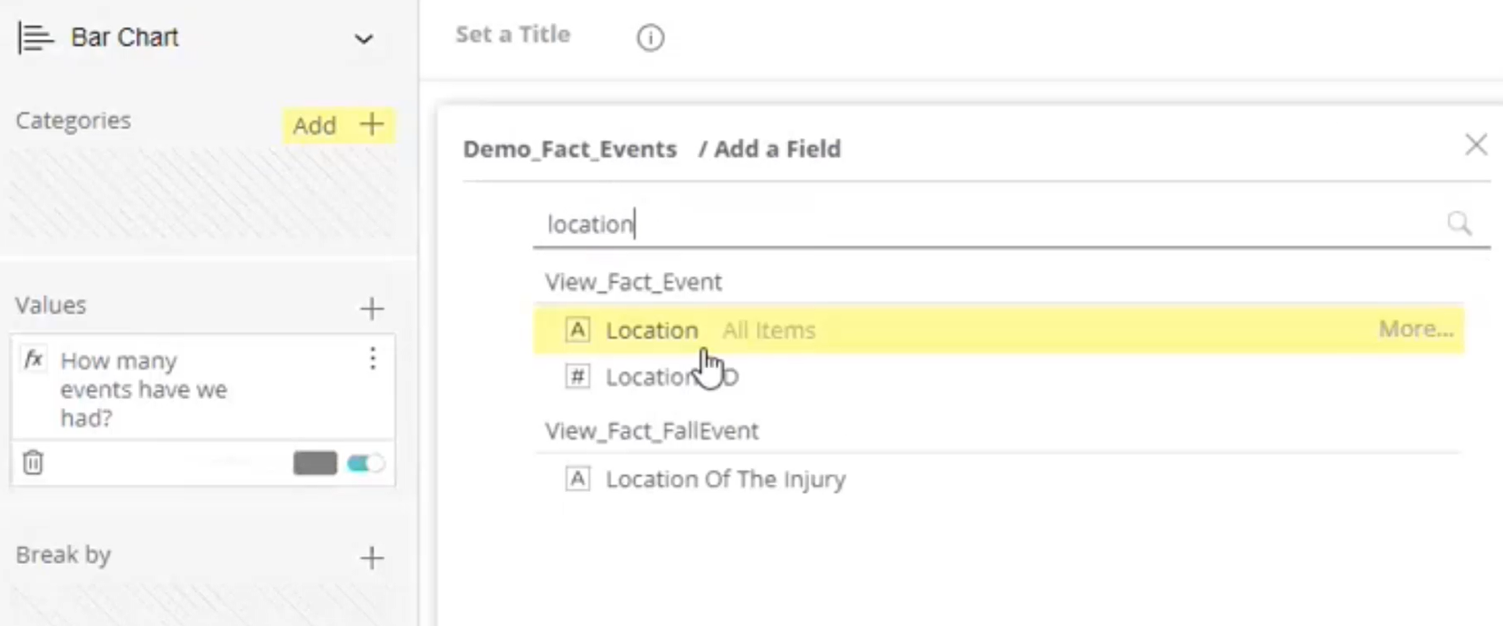
- Explore the options further should you wish to sort out how the data is being displayed. For example, would it benefit if the data was sorted by descending or ascending order?
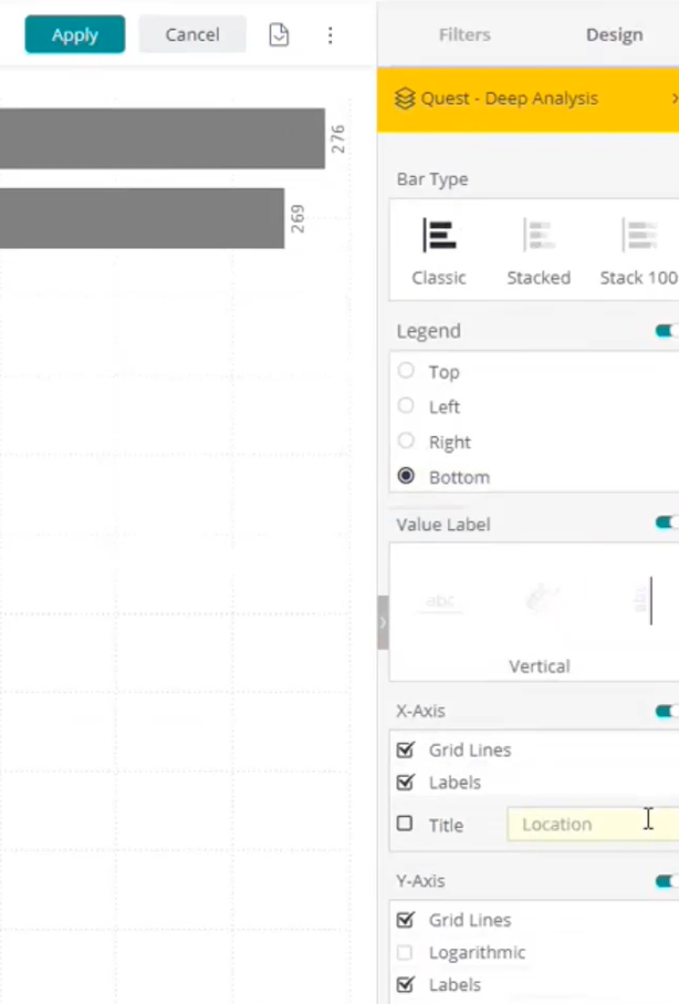
- We recommend exploring the design options on the left-hand side of the dashboard to amend the appearance of your visualisation. Would you like to involve the data values? Or include a title?
- The video below explores this in more detail:
- Deep dive into Dashboard building on the dedicated Sisense knowledgebase. There is a wealth of materials available. We recommend:
Example 2: A Trend Analysis
- To explore trends in your data we recommend using a Line Chart.
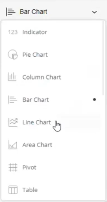
- Use the options on the right-hand side of the dashboard to add the data you wish to explore on this dashboard. For example, you may wish to include data options on the axis to be able to explore your data over time.
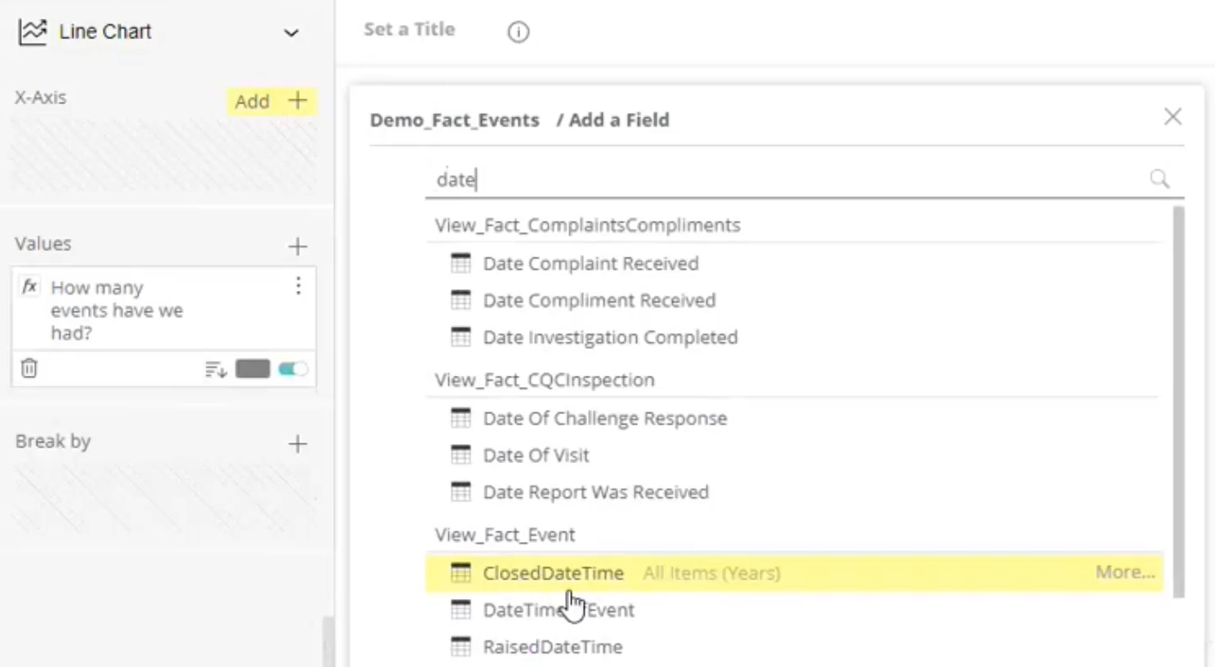
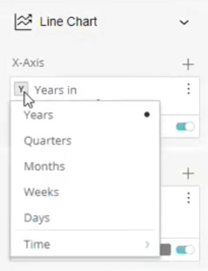
- Explore the options on the right-hand side of the dashboard to choose the right options for your data. In this example we are exploring how the date is being grouped, allowing us to show dates in years, months, etc.
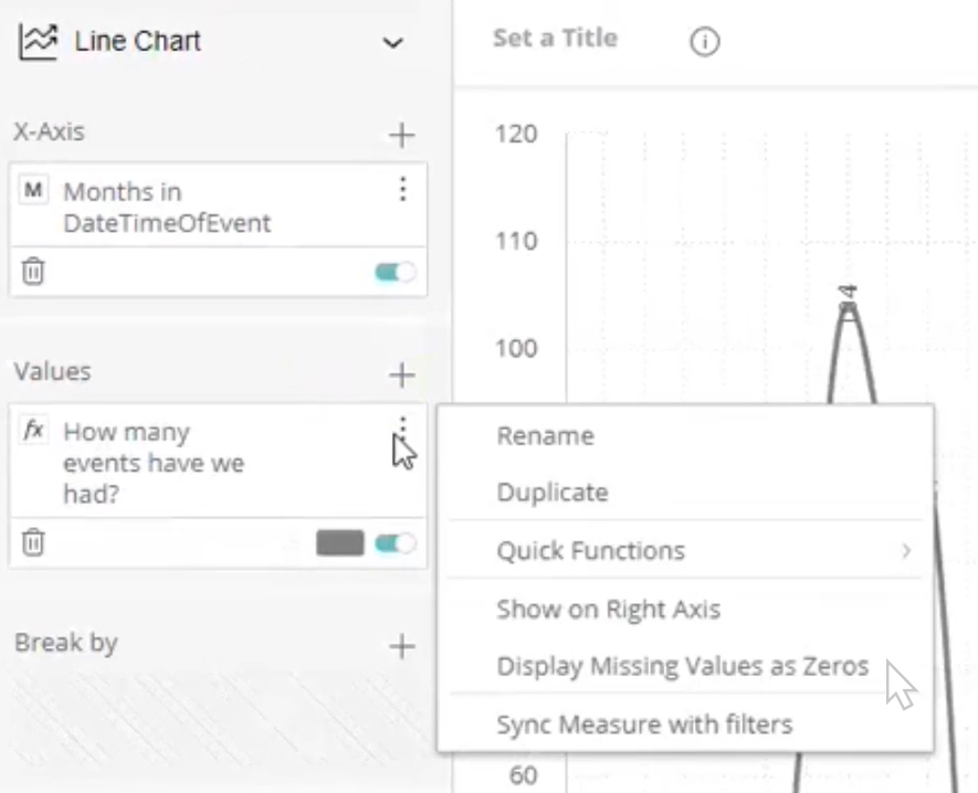
- Where there are blank values in your data, we recommend exploring the 3-line menu next to the name of your data and activating the option Display Missing Values as Zeros.
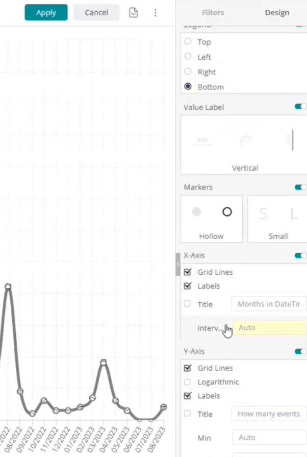
- With your visualisation in place, we recommend exploring the Display options on the left-hand side of the dashboard.
- The video below explores this in more detail:
- Deep dive into Dashboard building on the dedicated Sisense knowledgebase. There is a wealth of materials available. We recommend:
Adding Dashboard Filters
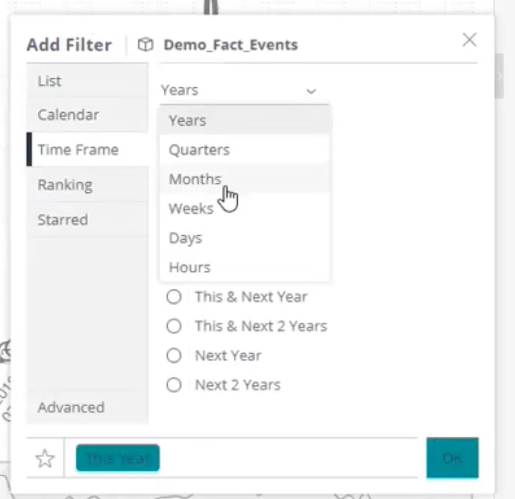
- On the left-hand side of your dashboard is the option to add filters. These can be used by your dashboard viewers to explore the data on the dashboard. Use the plus icon to find the data you wish to add as a filter. It is important this data is relevant to your data in the visualisations to allow the filtering to work effectively.
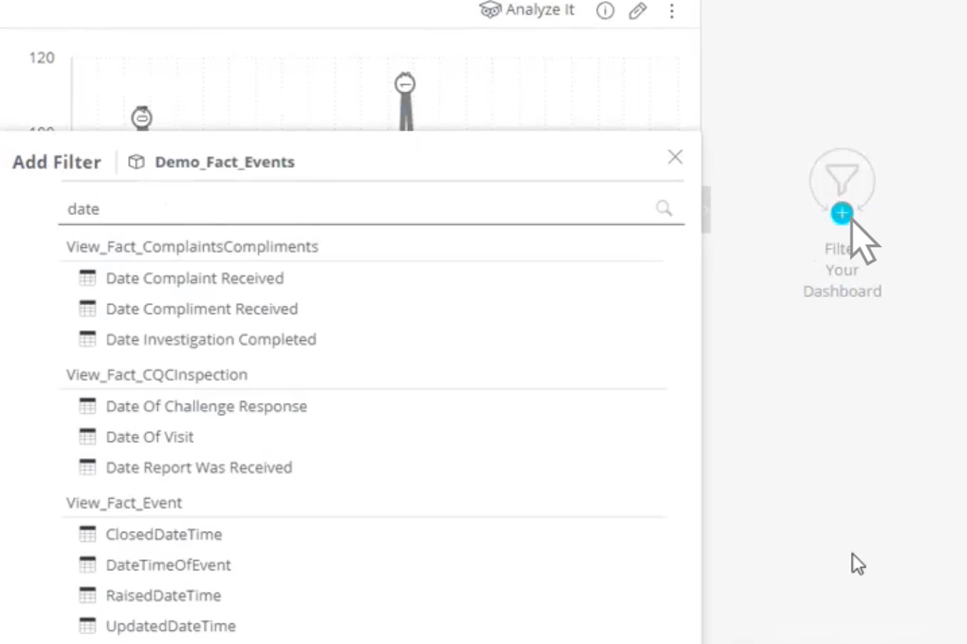
- Once you've selected your data, choose the default setting for the filter which your users will see when they launch the dashboard.
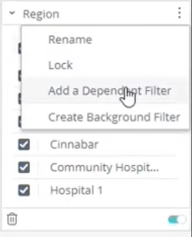
- If multiple datasets are interrelated, such as Regions and Locations, you can apply dependent filters. These will automatically filter down the information from the top filter into the dependant filter. In this example we're adding Locations as a dependency of Regions, therefore once a Region has been selected the list of Locations will already be filtered to show just the Locations in that selected Region.
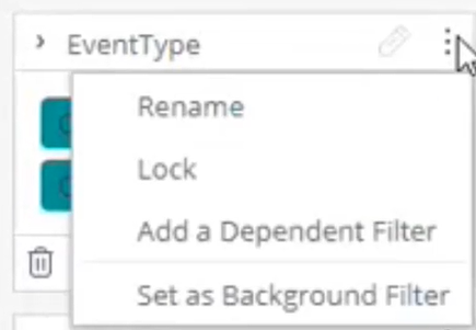
- There are lots of different options on filters and we recommend locking-down any filters which you wish to ensure your users cannot amend.
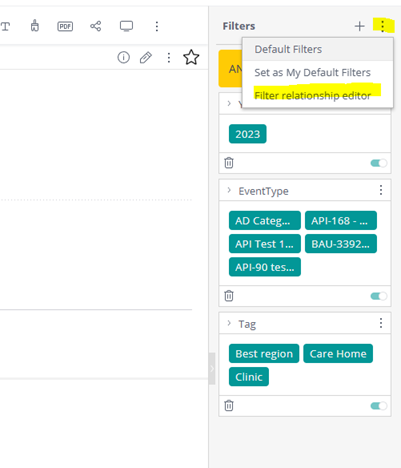
- You can also edit the relationship between existing dashboard filters to change the query result. This is done via the filter relationship editor, using an intuitive drag and drop and selection boxes, enabling you to:
- Change the order of blocks in a statement
- Change the operators used between blocks (choose between ‘AND’ or ‘OR’).
- Add parenthesis to change the logical order of the statement implementation
Note: There is a limit of 3 levels of depth per statement blocks hierarchy. There can be multiple hierarchies with depth <=3 per statement. This is unlimited, however, performance is expected to be affected by more complex statements.
- The video below explores filters in more detail:
- Deep dive into Dashboard building on the dedicated Sisense knowledgebase. There is a wealth of materials available. We recommend:
Further Reading
- When you wish to publish your dashboard into your Radar Healthcare system, we recommend seeing our guidance Publishing, Updating and Deleting Dashboards
- We recommend explore the Sisense Knowledgebase which contains a wealth of materials to support your dashboard building. Link to Sisense Document Knowledgebase
FAQs
Where can I explore to find out more about the Analytics Tools?
- We recommend exploring our Analytic partner Sisense's excellent Community Website and Knowledgebase.
Are there any courses in Analytics Dashboard design to build my knowledge and skills?
-
Yes. Our partner Sisense has an excellent online course in Dashboard design to increase your skills, knowledge and confidence in designing top-notch dashboards which drive user adoption and results! It is available at https://www.sisense.com/training/courses/

